The Impact of Color Psychology in Email Marketing
19 February 2026
Ever wondered why some emails instantly grab your attention while others get ignored? The secret might lie in something as simple as color psychology. Yep, the colors you use in your email marketing campaigns can significantly influence how recipients perceive your message, whether they engage with it, or even if they take action.
Color triggers emotions, influences moods, and can even affect decision-making. In marketing, this can be the difference between someone clicking that “Buy Now” button or deleting your email without a second thought. Let’s dive deep into how color psychology impacts email marketing and how you can use it to your advantage.
Why Color Psychology Matters in Email Marketing
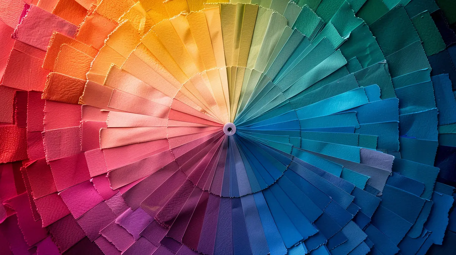
Colors aren’t just for aesthetics—they communicate messages, set the mood, and even drive conversions. Research shows that 90% of snap judgments about products can be based on color alone! In email marketing, where attention spans are shorter than ever, the right use of colors can dictate whether your email is read or ignored.Think of your inbox as a battlefield. Every email is competing for attention, and the wrong color choice could make your message blend into the background. On the other hand, using the right shades can:
- Boost readability
- Strengthen brand recall
- Influence emotions and actions
- Improve click-through rates (CTR)
How Colors Trigger Emotions
Each color evokes a different feeling. That’s why choosing the right palette for your email campaigns is crucial. Let’s take a closer look at how various colors impact consumer psychology and when to use them.
The Psychology Behind Common Colors in Email Marketing
1. Red – Urgency & Excitement
Red is a powerful and bold color that triggers emotions like excitement, urgency, and passion. That’s why it’s commonly used in clearance sales, limited-time offers, and CTA buttons.📌 Best used for:
- Flash sales or discounts
- Encouraging quick action (e.g., “Act Now!”)
- Creating a sense of urgency
🚨 Be cautious! Too much red can feel overwhelming or aggressive, so use it sparingly to avoid scaring off potential customers.
2. Blue – Trust & Dependability
Have you ever noticed that many banks and tech companies use blue in their branding? That’s because blue evokes feelings of trust, security, and professionalism. It’s a safe, non-intrusive color that makes people feel comfortable.📌 Best used for:
- Establishing credibility
- B2B communication
- Encouraging sign-ups or subscriptions
🟦 Pro tip: If you want your email to appear reliable and professional, blue is your best bet.
3. Yellow – Optimism & Attention-Grabbing
Yellow is the color of happiness, positivity, and warmth. It grabs attention without being too aggressive (unlike red). However, too much yellow can be straining on the eyes, so it’s best used in small doses.📌 Best used for:
- Highlighting deals or key points
- Creating a cheerful vibe
- Encouraging curiosity
💡 Tip: Combine yellow with dark colors (like black or navy) for a bold, high-contrast design.
4. Green – Growth & Relaxation
Green brings a sense of calm, balance, and eco-friendliness. It’s often associated with health, wellness, and financial success. If you want your email to feel refreshing and natural, green is a great choice.📌 Best used for:
- Promoting eco-friendly products
- Health and wellness campaigns
- Financial email newsletters
🌿 Bonus: Green is also linked with “Go” in traffic lights, making it effective for CTA buttons like “Get Started” or “Continue.”
5. Black – Luxury & Sophistication
Black screams luxury, power, and exclusivity. High-end brands use black in their marketing because it exudes sophistication and elegance. However, using too much black can feel cold or intimidating, so balance it out.📌 Best used for:
- High-end product promotions
- Exclusive offers or VIP events
- Minimalist, sleek email designs
🖤 Trick: Pair black with gold, silver, or white for a premium feel.
6. Orange – Energy & Friendliness
Orange combines the excitement of red with the warmth of yellow. It’s a fun, energetic color that fosters enthusiasm and creativity. If you want your emails to feel exciting without being too aggressive, orange is the way to go.📌 Best used for:
- CTA buttons (e.g., “Subscribe Now”)
- Promotions and new product launches
- Encouraging enthusiasm and engagement
🟠 Fun Fact: Orange stimulates appetite, which is why it’s commonly used in food marketing!
7. Purple – Creativity & Royalty
Purple is often linked with creativity, luxury, and wisdom. Many beauty and wellness brands use purple to evoke a sense of elegance and sophistication.📌 Best used for:
- Promoting beauty and wellness products
- Targeting a female audience
- Adding a sense of mystery or creativity
☂️ Tip: Use lighter shades like lavender for a calming effect, and darker shades for a more luxurious feel. 
How to Apply Color Psychology in Your Email Marketing
Now that we know how colors influence emotions, how can you use them effectively in your email marketing strategy? Here are a few key tips to maximize the impact of color psychology in your emails:1. Match Colors with Brand Identity
Your emails should reflect your brand’s personality. If your brand is all about trust and professionalism, stick with blues. If it’s about energy and excitement, go for reds or oranges.2. Use Contrasting Colors for CTAs
Your Call-to-Action (CTA) button is the heart of your email. Make it stand out by using high-contrast colors. For example, a red or orange CTA on a white or blue background can significantly increase click-through rates.3. Limit Your Color Palette
Too many colors can be distracting. Stick to 2-3 main colors to maintain a professional and visually appealing design.4. Consider Cultural Differences
Different cultures perceive colors differently. For instance, while white represents purity in Western cultures, it signifies mourning in some Asian cultures. Always consider your audience’s background when choosing colors.5. Test and Optimize
A/B testing is key to understanding what works best. Try experimenting with different color schemes and track which ones drive more engagement and conversions.
Final Thoughts
Color psychology is a powerful tool in email marketing. When used strategically, it can boost engagement, increase conversions, and enhance user experience. It’s not just about making your emails look pretty—it’s about influencing how recipients feel and react to your message.So, next time you design an email campaign, think beyond the words and focus on the colors—because they might just be the reason your email stands out in a crowded inbox.
all images in this post were generated using AI tools
Category:
Email MarketingAuthor:

Lily Pacheco
Discussion
rate this article
2 comments
Jocelyn Watson
Colors really do make a difference!
March 31, 2026 at 4:54 AM
Lily Pacheco
Absolutely! Colors can significantly influence mood and actions, enhancing engagement in email marketing.
Roxie Chapman
Understanding color psychology is crucial in email marketing; it influences emotions and decision-making. By choosing the right hues, businesses can enhance engagement and drive action, transforming an ordinary message into a compelling call to action.
February 20, 2026 at 3:41 AM
Lily Pacheco
Absolutely! Color psychology plays a vital role in email marketing, shaping emotions and decisions that can significantly boost engagement and encourage action.